How may milliliters are there in 3.2 liters?
A. 0.32
B. 32
C. 3200
D. 320
We know that 1 L =1000 mL, which we use to convert between the two units. The conversion fractions of interconverting are:

And

Since we want to end up with millimeters, the second conversion is used in converting L to mL as:
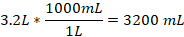
Thus, 3.2 L is equivalent to 3200 mL.
Therefore, the Correct Answer is C.
More Questions on TEAS 7 Math
-
Q #1: Which of the following is the greatest value?
A. 43÷55
B. 5/7
C. 0.729
D. 73%
Answer Explanation
we are asked to find the largest value from the options given. To solve this problem, we need to convert all the given values into fraction. Then find the least common denominator for all fractions, which we will use to multiply each fraction and make a comparison.
43÷
 55=43/55
5/7
0.729=729/1000
73%=73/100
Now, we need to find the least common denominator of 55, 7, 1000, and 100, which is 77000. We multiply each fraction by 77000 as follows:
43/55*77000=60200
5/7*77000=55000
729/1000*77000=56133
73/100*77000=56210
From the calculated values, it can be noted that 43/55 is the greatest value among the given options.
-
Q #2: A teacher has asked all the students in the class which data visualizer he will use to show relationship between their scores and number of subjects. Which of the following is the best way to display the frequency of each day of the week?
A. Histogram
B. Scatterplot
C. Pie graph
D. Bar graph
Answer Explanation
Histograms are used to present frequency of data of one variable over the other. On the other hand, a bar graph is used to compare the two variables with the rectangles not touching one another as in histograms. Scatter plots are used to show the correlations between two variables. In this case, the teacher will be able to use scatter plot to establish the correlation between test scores and the subjects.
-
Q #3: The graph below represents the amount of rainfall in a particular state by month. Which of the following is the total rainfall for the months May, June, and July?
A. 9.0 inches
B. 8.4 inches
C. 7.5 inches
D. 10.5 inches
Answer Explanation
: We need to find the total rainfall for the months of May, June, and July using the given graph.
In the month of May, rainfall is between 3 and 4, which is halfway. Therefore, rainfall in May is 3.5 inches
On June, rainfall was 3 inch and on July the rainfall was 2.5 inches. Thus,
Total rainfall=3.5 inches+3 inches+ 2.5 inches=9.0 inches
-
Q #4: Simplify the expression below. Which of the following is correct? 3.45 * 0.53
A. 1.8285
B. 18.285
C. 0.18285
D. 182.85
Answer Explanation
To solve the equation this equation, we use a calculator and find the product as:
3.45 * 0.53 = 1.8285
-
Q #5: As a company’s stocks increases, the production, sales, and investments also increase. Which of the following is the independent variable?
A. Sales
B. Stocks
C. production
D. investments
Answer Explanation
An independent variable is a variable that when changed result in a change to other variables under investigation. From the given scenario, if the stock of the company increases, then the production, sales, and investment increase. Therefore, stock is the independent variable while other variables are dependent.
-
Q #6: Which of the following values is the greatest?
A. 11/2
B. 5.4
C. 13/3
D. 6.25
Answer Explanation
Before we compare the values of the options, we convert the decimals to fractions.
5.4 becomes 54/10
6.25 becomes 625/100
Thus, the set of fractions is 11/2, 54/10, 13/3, 625/100. The least common denominator for 2, 10, 3, and 100 is 300, which we use to compare each options given.
11/2*300=1650
54/10*300=1620
13/3*300=1300
625/100*300=1875
From the above, 1875 is the greatest value which corresponds to 6.25. Therefore, 6.25 is the greatest value of all the choices given.
-
Q #7: A sweater that normally sells for $78 is marked 15% off. Which of the following estimates the sale price of the sweater?
A. $12
B. $66
C. $22
D. $69
Answer Explanation
we are to find the selling price of the sweater from the marked price and the discount. The marked price is given as
Discount=mark off rate*original price
Discount=15%*$78
Convert 15% into a fraction, which become 15/100=0.15. Then
Discount=0.15*$78=$11.70
The selling price of the sweater will be the original price less the discount or mark off value. Then,

Thus, the approximate selling price of the sweater is $66.
-
Q #8: How many feet are in 9 yards?
A. 45 ft
B. 18 ft
C. 36 ft
D. 27 ft
Answer Explanation
The interconversion of yards to feet utilizes the relationship 1 yard =3 feet. Then, 9 yards to ft becomes
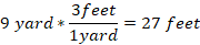 t
tThere, 9 yards is equal to 27 ft.
-
Q #9: Three friends are sharing a burger. One friend eats a quarter of the burger. The other two friends equally divide the rest among themselves. What portion of the burger did each of the other two friends receive?
A. 1/6
B. 1/4
C. 3/4
D. 3/8
Answer Explanation
: we are needed to find the portion of burger the two other friends share between themselves. A whole burger is 1, and we know that,
One friend=1/4 of 1=1/4*1=1/4
Remaining amount=1-1/4=4/4-1/4=3/4
Thus, ¾ of burger is left for two friends to share among themselves. Then, each friend will get
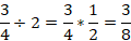
So, the other two friends will each get 3/8 of the burger.
-
Q #10: The table below shows the student’s score at the end of the semester. Which of the following would best display the data? Subject Math Chemistry Biology Physics English Test scores 90 72 85 95 63
A. Stem and leaf plot
B. Line graph
C. Bar graph
D. Scatter plot
Answer Explanation
The best way to visualize the student’s score for each subject is to plot them using a bar graph.