/

A recipe calls for 2.5 teaspoons of vanilla. 1 teaspoon equals approximately 4.93 mL. Which of the following is the correct amount of vanilla in mL?

A. 5.33 mL

B. 0.507 mL

C. 7.43 mL

D. 12.325 mL

Answer Explanation:

We let x represent the amount of vanilla in mL, since this is what the question is asking us to find.

Next, we will set up a proportion with number of teaspoons on the numerator and amount in mL in the denominator.

Cross-multiply to find the value of x

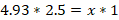
A recipe of 2.5 teaspoons equals 12.325 mL.

Therefore, the Correct Answer is D.

More Questions on TEAS 7 Math

  • Q #1: A bag contains five green balls, four red balls, and three yellow balls. If one ball is randomly selected from the ball, which of the following is the probability that the ball is red?

    A. 5/12

    B. ¼

    C. ½

    D. 1/3

    Answer Explanation

    The probability of an event is determined by the relation

    Finding the probability of drawing the red ball, we need to find the total number of balls in the bag.

    Total number of balls in the bag=5+4+3=12 balls

    The probability of drawing a red ball from the bag is 1/3.

  • Q #2: Kwame’s uncle is seventeen less than three times Kwame’s age. Which of the equations represents Kwame’s uncle’s age (u) as it relates to Kwame’s age (k)?

    A. u=17-3k

    B. k=3u-17

    C. k=17-3u

    D. u=3k-17

    Answer Explanation

    We are asked to find the Kwame’s uncle’s age in terms of Kwame’s age.

    First, we need to find the age of Kwame, which is k. Then, we know that Kwame’s uncle’s age is three times that of Kwame less 17. Then,

    Kwame’s uncle’s age, u = 3k-17.

    Thus, the relation that relates Kwame’s uncle’s age to that of Kwame is u=3k-17.

  • Q #3: A teacher has asked all the students in the class which days of the week they get up after 8 a.m. which of the following is the best way to display the frequency for each day of the week?

    A. Histogram

    B. Pie graph

    C. Scatter plot

    D. Bar graph

    Answer Explanation

    The best way to display the frequency of each day of the week when students get up after 8 a.m. is by using a bar graph. Bar graphs are well-suited for representing categorical data, where each day of the week is a separate category, and the height of each bar corresponds to the count or frequency of students waking up late on that specific day.

    Note: Histograms, on the other hand, are more appropriate for visualizing continuous or numerical data and are not ideal for categorical data like days of the week. Histograms are useful for understanding the distribution of data, identifying patterns, and assessing the shape of the data distribution, such as whether it's normally distributed, skewed, or has multiple modes.

    As you can see below, the Histogram is used to depict a pattern/continuous/range data. While a bar graph does just fine even with discrete data.