The scatter plot below shows the relationship between the student’s exam scores and the students’ heights. Which of the following types of correlation is shown on the scatter plot?
A. Positive
B. Positive and negative
C. Negative
D. No correlation
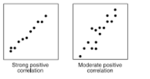
correlations fall into positive, negative, and no correlation. A positive correlation shows that an increase in one variable increase results in an increase on the other variable increases as shown.
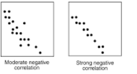
A negative correlation scatter plot shows that an increase in one variable results in a decrease on the other one.
The no-correlation scatter plot demonstrates that there is no response between variables. A change in one variable has no effect on the other variable.
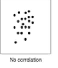
Looking at the provided scatter plot, the heights of the students does not have any relationship on the students’ scores. Thus, the type of correlation is no correlation.
Therefore, the Correct Answer is D.
More Questions on TEAS 7 Math
-
Q #1: Which of the following is the greatest value?
A. 43÷55
B. 5/7
C. 0.729
D. 73%
Answer Explanation
we are asked to find the largest value from the options given. To solve this problem, we need to convert all the given values into fraction. Then find the least common denominator for all fractions, which we will use to multiply each fraction and make a comparison.
43÷
 55=43/55
5/7
0.729=729/1000
73%=73/100
Now, we need to find the least common denominator of 55, 7, 1000, and 100, which is 77000. We multiply each fraction by 77000 as follows:
43/55*77000=60200
5/7*77000=55000
729/1000*77000=56133
73/100*77000=56210
From the calculated values, it can be noted that 43/55 is the greatest value among the given options.
-
Q #2: A teacher has asked all the students in the class which data visualizer he will use to show relationship between their scores and number of subjects. Which of the following is the best way to display the frequency of each day of the week?
A. Histogram
B. Scatterplot
C. Pie graph
D. Bar graph
Answer Explanation
Histograms are used to present frequency of data of one variable over the other. On the other hand, a bar graph is used to compare the two variables with the rectangles not touching one another as in histograms. Scatter plots are used to show the correlations between two variables. In this case, the teacher will be able to use scatter plot to establish the correlation between test scores and the subjects.
-
Q #3: If x represents the width of a rectangle and length is six less than two times the width, which of the following expressions represents the length of the rectangle in terms of x?
A. 2x-6
B. 6-2x
C. 6x-2
D. 3x-4
Answer Explanation
To form an equation from the word problem, first break the given statement into smaller statements.
First, we are given the width of the rectangle as x. We are told, the length is two times width. Mathematically, this means
Length=2*width=2*x=2x
Now, the length is 6 less than 2 times width of the rectangle. Thus, the length of rectangle in terms of width becomes:
Length =2x-6
Thus, the length of the rectangle is 2x-6.